UI Rapid Design: Code Your Dreams

Background
Code Your Dreams is a Chicago-based nonprofit that values social justice and equal tech opportunities. They provide project-based, student-center classes that enable young people from diverse backgrounds to enter the tech industry.
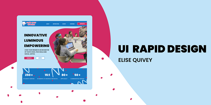
Code Your Dreams tasked me to have a new high-fidelity landing page for their site that spoke to fundraising needs. I was excited to make their new website not only encourage more donations, but also amplify their brand’s online visual identity with a a trendy new landing page. I saw this as an opportunity to inform potential donors while creating a vibrant connection with the brand through visual storytelling.

Research
To start my research, I spent time comparing the different features of other nonprofit landing pages to the current Code Your Dreams website. Initially, I noticed a few things that were undeniably important elements to have on a page looking to fundraise:
Bright CTA Buttons: The use of colorful, eye-catching calls to action used throughout the page (usually focused on partnering or donating) was prevalent on every nonprofit webpage I looked at.
Emotion-provoking imagery: Although I was initially drawn to the idea of using illustrations, I noticed that most charitable organizations online presence had images throughout the site instead. Providing the company with a face, whether it is a partner, owner, or consumer, creates a sense of empathy.
Stats: The use of quick, eye-catching stats at the top of the page is a good way to quantify the brands goals, opportunities, and triumphs.
Partners and News Coverage: Placing images, headlines, and links to outside sources that have partnered with or featured the nonprofit creates trustworthy and credibility to the user.
I knew with the help of these four elements, I could build a landing page that would create a feeling of trust with the Code Your Dream brand. It was a goal of mine to use these elements to create emotion-provoking storytelling throughout the site, and I knew the best way to test that out was by starting the sketching process.
Sketching
After prioritizing what needed to be on the new landing page, it was time for one of my favorite parts of the design process: sketching. I started with a what I refer to as the mega sketch. Typically the first sketch I do when I start a new project, I ignore information architecture and simply sketch every single element I can picture on the page. If I’m considering multiple ways to create a carousel, I sketch them all. I scroll and sketch and scroll and sketch until every idea I have is on paper.

After sketching out all of the possibilities I could think of of different sections, headers, components, and elements: I start to prioritize. I see what elements fit the best together. I start to make more reasonably sized web page sketches. I condense and prioritize information. Usually I make 3–4 of these sketches. After I was happy with the final sketch, I started the process of creating it in Figma.
Visual Identity
In order to make sure that the Code Your Dreams brand was apparent throughout the site, I decided to make a style guide that I would follow. I decided to stick with the original theme of the website, which was a vibrant pink and lively blue. In the current website, baby blue was used as an accent color. In the new version of the website, I wanted to make it the primary color. It is a bit less intense and also amplifies the dreaminess of the site, while the pink adds a splash of fun.
I also kept the same font, in varied weight and sizes, throughout the website. I ended up choosing 6 different paragraph styles to create contrast throughout the page. Since we were asked to keep this landing page to about 4–6 scrolls, I didn’t want to add too much variety that may create a cluttered feeling. Cohesion was key, and I was really happy with the results!

As for the Code Your Dreams logo, I decided to keep it the same bright, vibrant shade of pink that it currently resides as. In order to make it pop against the secondary colors, I took it into Photoshop to create a thick, bold, white stroke on the outside of it to create contrast. This made it especially pop against the darker blue shade that was on the website.
I created two buttons to be sprinkled throughout the website: a main call to action button and a secondary button. The main button is the pink that was intended to stay with the same “Donate” CTA throughout. All other call to actions were in a bold, but more subdued blue and white button.
My favorite elements to add to the page where the blobs, which were a fun take on a cloudy feeling. Blobs are really trendy within design, and I thought they were the perfect addition to the fun, childlike, but still hip, website. My blobs were scattered throughout the site in all three of the colors.
In order to add more pizazz, I also scattered a dot and zigzag shape in some sections of the website. When placed sporadically, but with intention, the website was left with a cute, fun, and trendy aesthetic that I thought fit the Code Your Dreams visual identity.
Feedback and Iterations
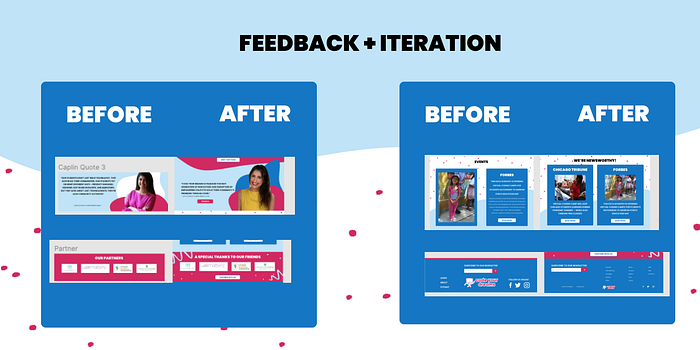
Initially, I set up each of my screens to have stark cutoffs from page to page. After receiving feedback that this made my pages feel claustrophobic, I created extremely large blobs to make the scrolling through different sections more cohesive.

Other pieces of feedback I iterated before my final version:
Alignment and spacing: As someone new to following a 16 column gridline, I knew there were a few spots I needed to clean up before calling my page completed.
Smooth page transitions: Towards the bottom of the page, the elements felt a little clunky. Since there were smaller sections, the wavy element felt more awkward. I applied my secondary elements, the dots and squiggles, to make it feel more fun and cohesive towards the bottom.
Footer: My initial footer felt unprofessional. I didn’t have enough information down there. I did a competitive analysis of other footers to create a more streamline one.
After a full day of making these changes, I was happy with the way my landing page looked.

Final Thoughts
My new homepage for Code Your Dreams fits the task of creating a new landing page that values fundraising while elevating the brands visual identity. I was happy with the cohesive, trendy feeling while scrolling through the page.
This project provided me with an opportunity to experience rapid prototyping for a nonprofit I became incredibly intrigued by. Diving into Figma was a new experience for me, but learning all of these new UX software systems has proved to be fulfilling for me. I am excited to take on our last project in the next few weeks!
