ShareMyJourney: Creating Trust through Visual Design

Background
ShareMyJourney is an online community that connects caring people to share knowledge and their life experiences to others who need to be lifted up while navigating through the hardships of their own life.
For instance, let’s say you are going through something personal like a health, parenting, or school issue. You would log onto sharemyjourney.org, apply to be a member, and get 1:1 personally matched with someone who has been through the same thing and is willing to char and give advice on it. It’s a business based on caring for one another: any member can give or receive advice on any topic of their choice. Simply put, it’s a community based in lifting one another up.

The Task
Rebecca Cohen, the owner and CEO of ShareMyJourney, knew people where visiting her site but wasn’t sure why they weren’t signing up to become a member. We were tasked to find out why this was happening, how to fix it, and to create a higher conversion rate once a user visits the site.
User Research

In order to find out why people weren’t signing up for a ShareMyJourney membership, we first dove into some user research. We conducted nine interviews with females aged 24–64. We focused on questions such as:
- “How do you normally find guidance with things in life that you are unfamiliar with? (big changes, transitions, traumatic events)”
- “What are your reservations around opening up emotionally to someone you are matched with online?”
- “What do you think the advantage of real life stories is over professional advice?”
Through the answers to these questions we made an extremely detailed affinity map to visualize who people look to for advice and what is important to them when it comes to sharing this personal information.

From here, we were able to gain some notable insights. Trust was the biggest fear people had when opening up about their personal issues — especially online. If people wanted to reach out to strangers, they wanted to ensure their information was safe from being released. Our interviewees weren’t opposed to looking for advice online as long as it was in a safe, nonjudgemental place. This was a great insight for us!
Next, we conducted seven contextual interviews to see what new site visitors thought about the current sharemyjourney.org website. Throughout these 25 minutes interviews, there was four reoccurring issues we ran into:
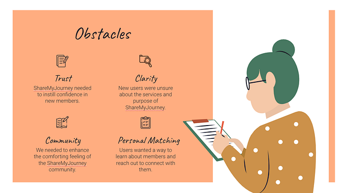
- Trust: Reiterating what we found from our interviews, people’s biggest apprehension was sharing their personal information online. The current website did not have many reassurances that they were a trustworthy brand with sensitive information.
- Clarity: Most of our users were confused on what ShareMyJourney’s goals and objective was.
- Community: People enjoyed the aspect of community that the site inspired, but wanted to see it elevated. This would also increase the brand’s trust.
- Personal Matching: 60% of our users wanted the ability to read about other member journeys on the websites and be able to personally request to be matched with them.
After we concluded all of our user research, we came to a problem and solution statement:

Competitive and Feature Analysis
In order to create an intuitive website, we also conducted some research on our competitors. We looked at direct competitors: these included self-help companies and therapy groups such as Sat Nam, Your Cancer Story, and Good Therapy. We also looked at non-direct competitors with similar subscription options such as Hulu and HelloFresh.

From here, we came to the conclusion that there were a key elements that were necessary on the site redesign:
- Eye catching CTA’s: to encourage visitors to sign up
- Upfront, full-page pricing plans: for clarity on different pricing packages
- Testimonials: to create authentic trust in the product and services
- Informational cards and icons: the easiest, trendiest way to present a lot of information in one screen
- Articles and blog posts: to help build authenticity and validity
With all of this research in mind, we came to the conclusion that there was actually two separate audiences we needed to keep in mind throughout the design process, the Service Provider and the Receiver. Basically, these are the two opposite spectrums of the ShareMyJourney experience: those willing to give advice and those looking for it.

Sketching
After concluding all of the research, we started sketching! Keeping the journey of the Service Provider and the Receiver in mind, we decided to focus on redesigning three webpages on ShareMyJourney with these goals at the forefront:
- Homepage: focus on providing clarity of the purpose and goals of ShareMyJourney
- About Us: building off of the homepage, we aimed to create more clarity and trust with the user
- Spotlights: to build authentic trust with member testimonials and amplify the community feel.
We conducted a design studio for each of these pages with 2–4 iterations of each.

After building off of our favorite ideas and designs as a team, we started building the wireframes. Here our the final sketches alongside our initial wireframes for each webpage:
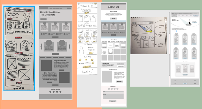
From this point, we started building the pages in higher fidelity, conducting usability tests for each round. Since my role was focusing on iterations of the About Us and Pricing pages, I will explain the steps and processes I went through.
Style Guide
Based on feedback from the owner and our users, we decided to make a new style guide to follow through the design process. The original colors were grey, black, and a baby blue. Rebecca Cohen, the founder of ShareMyJourney, said she wanted colors to be more influenced by nature. She wanted us to take inspiration from walking down a path with someone, sharing our thoughts and feelings. With that in mind, we created this style guide:

Users responded especially well to the color changes: most used words such as calming, holistic, and comforting to describe it. I created a new logo to fit with the new theme as well. Inspired by an outward ray of sunshine, our users agreed this was fitting to the brand and overall feel of the website. Once we had the colors, fonts, and buttons nailed down, it was time to get working on the final product!
Feedback and Iterations

Here are a few specific changes I made throughout my different iterations of the About Us page:
- Brand Guidelines: making sure text sizing, alignment, and color changes were cohesive with our new style guide.
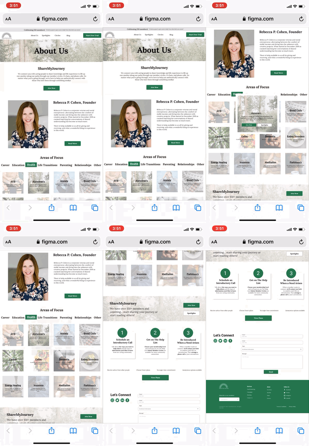
- Information Architecture: I rearranged elements based on what my users journey was while scrolling through the page. The biggest change here was adding the information about the founder closer to the top of the page. Rebecca’s photo and information provided a friendly and welcoming face to the brand. This was more important than ushering users to sign up right away.
- Clickable Areas of Focus: Through user testing I noticed most people did not realize that the areas of focus changed if clicked. I fixed this by creating an accent background and bolded text on the selected area of focus, enticing the user to click the other elements. This customization of the page proved to test extremely well. Visitors were encourage to create their own journey through the webpage, further inspiring a welcoming feel and encouraging them to share their journey as well.
- Visual Design of Cards: I originally created six different versions of cards. Once committing to one format, I tested the best way to convey all of the information. Having too many buttons (as seen in my mid-fi prototype) confused the viewer. In my final iteration, clicking on a card creates a pop up with more information and links to other pages instead of cluttering one screen with so many CTA’s.
- Contact Form: I focused on making this more updated and sleek through each iteration.
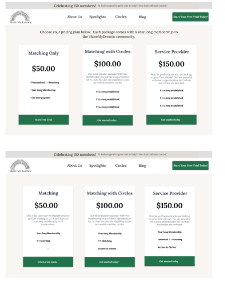
The pricing page was based heavily off of our feature analysis of big name competitors such as HelloFresh or Hulu. Because of this, we didn’t have too many changes to make. Some of the small changes included rearranging copy, updating spacing, and general alignment to fill the screen. My users especially preferred having the extra paragraph in the pricing cards for the most clear information on which each package included.
After conducting 11 usability tests and iterating based on the feedback we learned from those, we created our final prototype. You can view it here!
Conclusion
After multiple rounds of testing, we are positive that our visual changes based in our user research created more trust, clarity, and feeling of community to those visiting sharemyjourney.org. The feedback we received on our final rounds of testing were almost completely positive. People used words like “caring” and “helpful” to describe the site and its goals.
Making ShareMyJourney a customizable experience proved to be beneficial in creating a welcoming, community feeling. Featuring testimonials created feelings of authenticity and trust. Providing concise information on sign up and different pricing packages proved to enhance the clarity of the site overall. The ShareMyJourney website redesign was such a wonderful reminder on how important constant testing and user research is throughout the entire design process.


