Civic Suds: Research, Ideation, and Iteration for a New Booking Flow
Background
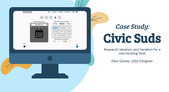
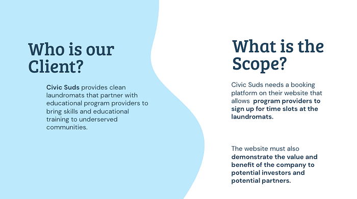
Civic Suds is a nonprofit organization bringing learning opportunities to people who rely on laundromats. Civic Suds provides clean laundromats with 24/7 internet access, classrooms, and conference centers. They partner with other local organizations to provide free informational classes. We were tasked to create an intuitive booking component to ensure seamless scheduling for these partners. We were given three weeks to do the research, synthesis, ideation, and iteration.
Research
After discussing the initial ask and doing some company research, my team of designers focused on two topics for our research: our target audience and our competitors.
What are Civic Suds partners’ wants, needs, and pain points?
Through our initial company research and and discussing the task at hand, our team decided the target audience for the booking component would be potential partners. These would include nonprofit owners, event planners, and socially aware citizens with personal knowledge and skills they would enjoy sharing with their community. We would learn about these partners wants, needs, and pain points through surveys, interviews, affinity mapping, journey mapping, and more.
What is and isn’t working for competitors?
We deducted that our competitors were broken up into two sections: other nonprofits with impressive landing pages and booking calendar systems. We looked at both of these with an analytical eye. We used research methods such as competitive analysis, task analysis, and usability tests to get a better understanding of what was and wasn’t working for our competitors.

We started off with sending two surveys out on Twitter, Facebook, Linkedin, and Instagram. One survey focused on those who rely on laundromats to gauge their habits. The other survey focused on people who had experience scheduling an event, class, or workshop for an organization. Total, we got 96 responses and extremely useful information.
For our interviews, we spoke with 6 professionals who had experience booking events online. They were located variously throughout the United States, so the interviews were conducted virtually over zoom. Here is some noteworthy information from our findings:

The biggest takeaways were that integration, confirmation, and a sleek booking system were our biggest priorities when it came to design. One interviewee, a professional who works directly with nonprofits, said:
“I am so inefficient because I cannot be a master of all of these tools. How do I find the best tools that integrate the best, so that our work can be the most efficient?”
After taking notes from each interviewee and discussing them as a group, we decided to make an affinity map to help narrow our focus on which problems mattered most to the users. Most of our interviewers relied on a larger calendar platform, such as GCal or Apple Calendars, and found it crucial to easily add their event through any booking platform. Other trends that popped up needing multiple reminders, confirmation pages, and easy booking.

We knew our partners were busy and wanted to make booking with Civic Suds a quick, seamless process. In order to research different ways to book events online, we conducted Competitor Task Analysis and Competitive Feature Analysis to see what features our biggest competitors such as Calendly and Eventbrite were doing.


It became apparent that most of our competitors synced calendars, sent notifications, had a customer portal, and sent confirmations. This matched up with our research. We were excited to take all of this information and start the sketching process.
The Problem
Civic Sud’s partners need an efficient booking platform that can integrate calendars as well as give reminders and confirmations, because the amount of different tools they already have to use day to day is overwhelming, and their free time is scarce.
Secondly, potential partners and investors also need an easy intuitive way to learn about Civic Suds.
Ideation
After coming to this conclusion, my team and I jumped in creating different user flows and a sitemap. We focused our flows on three different types of users:
- Investors, who needed informational, sleek, emotion-provoking homepage to inspire donations.
- Potential partners, who needed an informational homepage and simple application process to partner with us.
- Existing partners, who needed a seamless booking system and straightforward account page.

After coming up with the bones of the site, we started sketching based on our competitive analysis of our nonprofit competitors. We knew we wanted to have emotion provoking stats, calls to action, testimonials, and past events.

We also had a design studio regarding the booking process. Together, my two teammates and I did various sketches of the booking flow. We spent five minutes each sketching eight booking pages. This process lead to a lot of varied, and also similar, elements that were popping up.
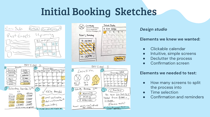
We had a basic idea of how we wanted the calendar to flow, but we needed to do some testing to figure out what was the most intuitive way to move forward with our prototype. To do this, we made clickable wireframes for three different booking processes and tested them on 8 users.

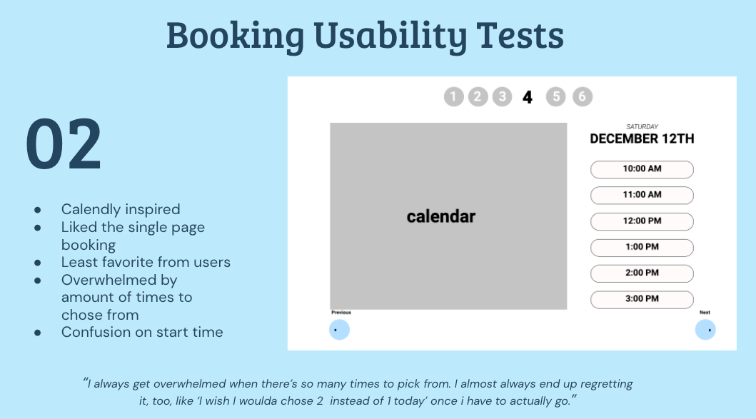
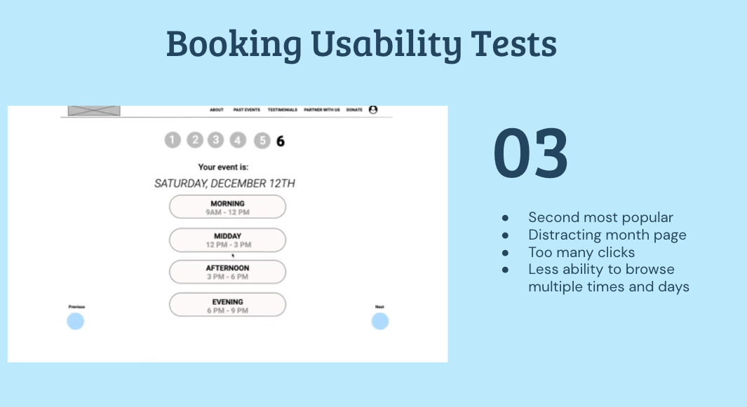
In conclusion, we ended up taking a few elements from each of the calendars and forming a new one based on the feedback:

Our final calendar included necessary elements in the booking flow, including:
- Single page booking flow, which gave the user flexibility to browse different day and time availability with fewest clicks.
- Separated time selections, the user gets less overwhelmed by choosing between Morning, Afternoon, or Evening hours and choosing from the 6 times listed.
- Choosing the duration of the event, which takes away the pain of learning how to choose how long the event will be.
These changes tested better than our earlier iterations, so we went on to bringing our pages to life in Axure!

View our landing page and entire booking system prototype here.
Next Steps
As a team, we discussed what we would move forward with in our next round of testing. We decided on a few key things:
- Making a responsive version of our current pages
- Testing and creating a flow for a Civic Suds admin side
- Creating a high-fidelity, clickable prototype of our landing page and booking system
Conclusion
The new Civic Suds landing page and booking system is intuitive and informational. A landing page with multiple pictures, stats, testimonials and stories provokes emotion and provides information for potential partners and investors. The new booking system is a sleek and seamless way to ensure partners have an easy way to book their new event, have it integrate easily, and set reminders as often as they want.
